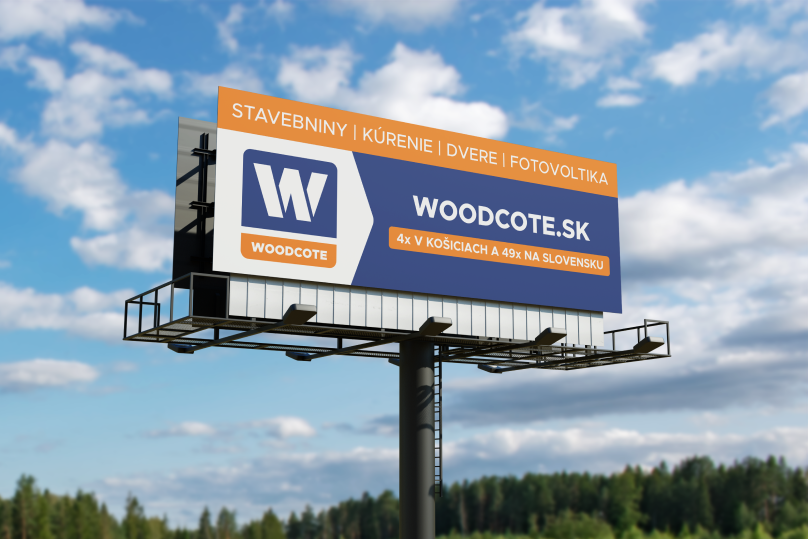
Strength in partnership
under one roof

CLIENT

Woodcote Group a.s.

LOCATION

Bratislava, whole Slovakia

YEAR

2021

We united several divisions that operated as separate companies under one roof and gave a unified tone of voice.

Brand Identity     Strategy    Launch Campaign     Social Media

Main challenge

As our longest client, we know Woodcote Group and all its businesses back and forth. Yet, when they decided it is time to update its face to appeal to the current market trends, we knew that will be a one thrilling challenge. And it was!

Handful of businesses grouped under one roof, each with a completely different business model and an audience with different needs. Their diverse divisions allow them to work with a variety of clients from different fields. The goal? Make them all together visually cohesive, so people understand what

Woodcote Group covers. However don’t alienate any group of customers. A tough one.


And as a bonus, we had a chance to update the visual style, so it.


  1. becomes more stylish and attractive for the current market
  2. gets cleaner and more understandable.

Our solution

Brand identity

Starting with the branding we roughly knew the direction forward. Client from the beginning liked the idea of bringing new contrasting colour to the logo. Woodcote has always stood strong in construction market for being blue – not very usual trend in the industry. It lacked something, though. And adding a hint of contrasting orange made a huge difference. More stylish, more inviting, more alive.

With all the divisions being visually very different from each other, we wanted to find something that will connect them all together. W in Woodcote has always been a strong symbol which we decided to lean on and use as a roof to cover all the brands.

After the logo, whole brand identity was repurposed and quite

significantly remade into something more cohesive, simple and fitting for the brand.

Next, updating logos of all brands, assortments or private labels followed which included a strategy for how and when to use the right logo + colour coding and minor tweaks in the main brands’ visual style, to assure reaching the right audience.

We reconsidered photography style of each brand, making sure it speaks to the right person, as Woodcote brands speak to quite different audiences.

launch campaign

One of the important factors for Woodcote has been building the brand awareness on the Slovak market. It was important that we educate everybody on this new change.

Externally, we executed the launch over several different channels including billboards, PPC, social media. To educate already existing customers, we created informational leaflets and posters that were distributed over all Woodcote Group branches. We also created launch video that was played on store TVs.

As most changes usually start within, it was crucial to educate employees on the updates and what they will mean for them. We created an internal document with a message from CEO that informed and encouraged – to help build the brand together, give personal suggestions and support the change.

Social media

As part of the launch, we also updated existing social media pages and created new ones for brands that had not had them before – we chose the right platforms for each brand and its audience.

Our marketing specialists created content strategies with relevant goals in mind for each page – brand awareness, product promotion, supplier’s campaigns promotion.

Branches refresh

Goals here were to clean and simplify. To think of the store and its surrounding advertisment or navigation as one unified piece of design. We put emphasis on making the navigation and information clear and pleasurable for the customer and make it inviting for people to visit the store.

Updating the stores has been one of the bigger challenges in this rebranding. Woodcote owns very different type of branches which are not unified among each other. We had to find a way, how we can apply the branding to work for each store, keep the brand consistent and make it budget-saving for the client.

Packaging

Big part of the Woodcote Group family are also private labels with their own portfolio of products. The approach here was similar to the whole rebranding – we wanted to find a way, how to unify the products visually and make strong product brands, which will be attractive for the customers to reach for on the shelves and position them right to stand out among other established products from the competition.

This is of course too interesting, to not have an individual case study.

Baustore

This special e-commerce child of the family had to wait for its moment, so we got to proper rebranding of Baustore a little bit later. Find out how it went here.

Do you need a redesign and marketing?
Let’s work together!

Testimonial

View more case studies